
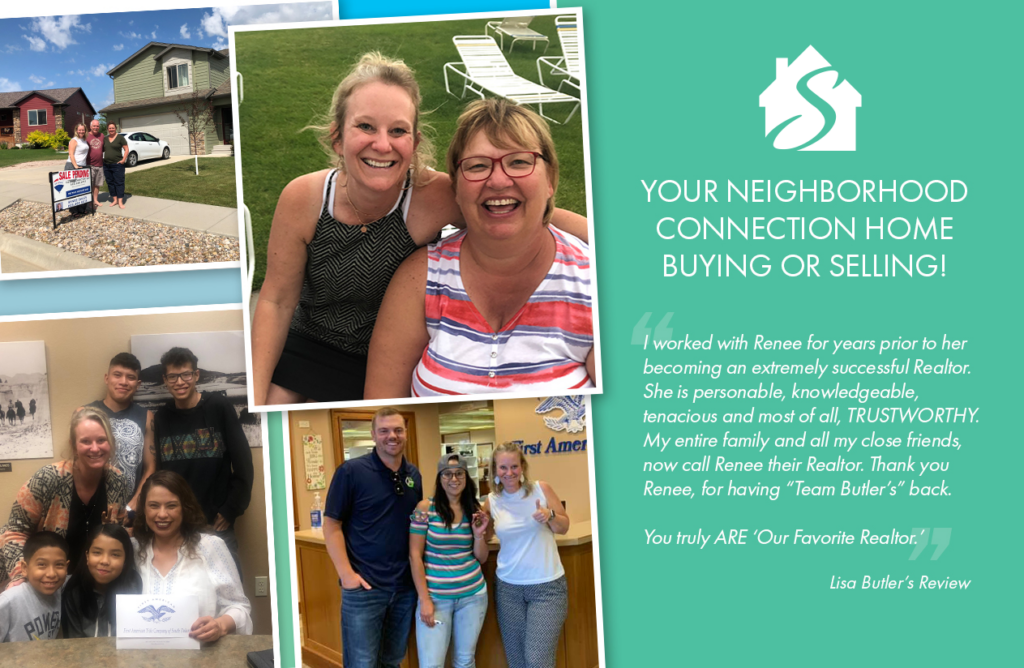
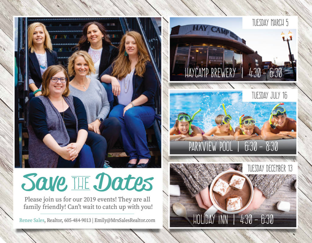
The Sales Connection
The Sales Connection is a Rapid City-based real estate team dedicated to the journey of finding home. This project focused on creating a visual identity that resonates with the optimism of new beginnings.
Concept Development
The initial design phase involved an extensive visual exploration to anchor the brand in its South Dakota roots. I experimented with several symbolic directions, including:
Geographic Identity: Integrating the state silhouetted outline to emphasize local expertise.
Functional Iconography: Incorporating key motifs to symbolize “new beginnings” and unlocking potential.
Typographic Studies: Testing various primary letterforms and “S” connections to represent the team’s networking strength.
Description
The Sales Connection
Goal
The goal was to differentiate the team in a saturated market by moving away from traditional, corporate real estate aesthetics. The branding needed to feel approachable yet professional, capturing the specific "sense of place" unique to the Black Hills region.
Strategy
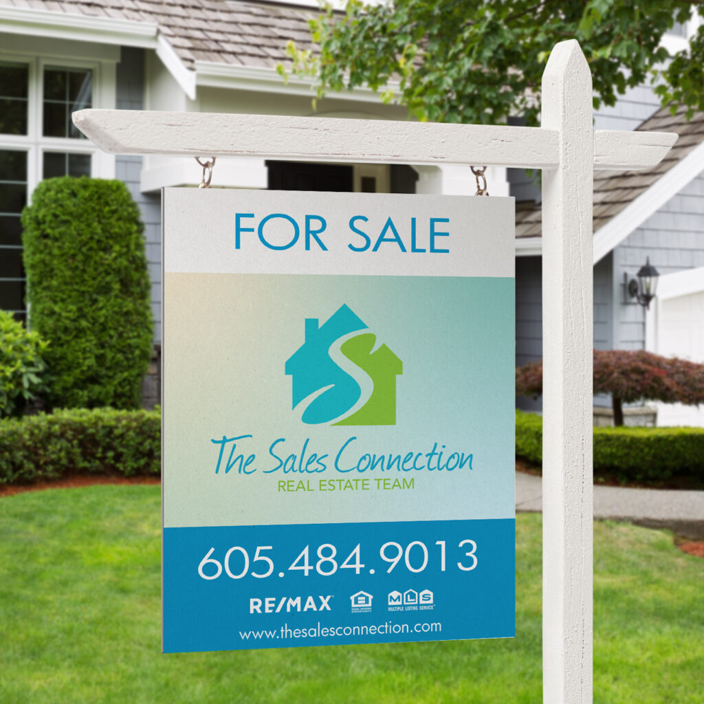
Drawing inspiration from the vibrant South Dakota landscape, the color palette utilizes lush prairie greens and expansive sky blues. This high-contrast approach ensures the identity is instantly recognizable across digital platforms and physical signage.
Deliverables
Primary Brand Identity: A modern, scalable logo.
Color Theory & Typography: A custom palette and type system optimized for readability.
Brand Language: A cohesive visual style reflecting the team's commitment to the local community.